サンプル(DEMO)


本サンプル表示用HTML
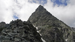
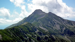
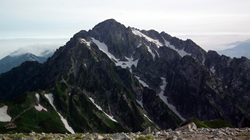
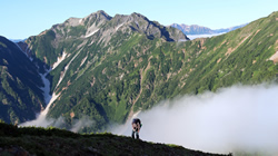
<div id="stage">
<div id="box1">
	<div id="thumb1"><a href="#p1"><img src="img/yari.jpg" width="200" height="112"></a></div>
	<div id="title1"><img src="img6/yari_t.jpg" width="200" height="112"></div>
</div>
<div id="box2">
	<div id="thumb2"><a href="#p2"><img src="img/hodaka.jpg" width="200" height="112"></a></div>
	<div id="title2"><img src="img6/hodaka_t.jpg" width="200" height="112"></div>
</div>
<div id="box3">
	<div id="thumb3"><a href="#p3"><img src="img/shirouma.jpg" width="200" height="112"></a></div>
	<div id="title3"><img src="img6/shirouma_t.jpg" width="200" height="112"></div>
</div>
<div id="box4">
	<div id="thumb4"><a href="#p4"><img src="img/kasa.jpg" width="200" height="112"></a></div>
	<div id="title4"><img src="img6/kasa_t.jpg" width="200" height="112"></div>
</div>
<div id="box5">
	<div id="thumb5"><a href="#p5"><img src="img/turugi.jpg" width="200" height="112"></a></div>
	<div id="title5"><img src="img6/turugi_t.jpg" width="200" height="112"></div>
</div>
<div id="box6">
	<div id="thumb6"><a href="#p6"><img src="img/harinoki.jpg" width="200" height="112"></a></div>
	<div id="title6"><img src="img6/harinoki_t.jpg" width="200" height="112"></div>
</div>
<div id="p1" class="photo"><img src="img6/yari_l.jpg"><span class="cls"><a href="#p11">X 閉じる</span></a></div>
<div id="p2" class="photo"><img src="img6/hodaka_l.jpg"><span class="cls"><a href="#p11">X 閉じる</span></a></div>
<div id="p3" class="photo"><img src="img6/shirouma_l.jpg"><span class="cls"><a href="#p11">X 閉じる</span></a></div>
<div id="p4" class="photo"><img src="img6/kasa_l.jpg"><span class="cls"><a href="#p11">X 閉じる</span></a></div>
<div id="p5" class="photo"><img src="img6/turugi_l.jpg"><span class="cls"><a href="#p11">X 閉じる</span></a></div>
<div id="p6" class="photo"><img src="img6/harinoki_l.jpg"><span class="cls"><a href="#p11">X 閉じる</span></a></div>
</div>
HTMLのスポット説明
・<div id="thumb1"><a href="#p1><img src="img/yari.jpg" width="200" height="112"></a></div> と、<div id="p1" class="photo"><img src="img/yari_l.jpg"><span class="cls"><a href="#p11">☓ 閉じる</span></a></div> で、
記述内リンクを貼り、css の target 擬似クラスを使ってクリックに該当する写真の transition を作動させている。
本サンプル表示用CSS
/* 表示枠 */
#stage {
	position:relative;
	width:630Px;
	height:390px;
	background:#333;
}
/* タイトルボックスのサイズと配置 */
#box1,#box2,#box3,#box4,#box5,#box6 {
	width:200px;
	height:112px;
}
#box1 {
	position:absolute;
	left:5px; top:10px;
}
#box2 {
	position:absolute;
	left:215px; top:10px;
}
#box3 {
	position:absolute;
	left:425px; top:10px;
}
#box4 {
	position:absolute;
	left:5px; top:132px;
}
#box5 {
	position:absolute;
	left:215px; top:132px;
}
#box6 {
	position:absolute;
	left:425px; top:132px;
}
#box1 img,#box2 img,#box3 img,#box4 img,#box5 img,#box6 img {
	position:absolute;
	left:0;top:0;
}
/* タイトルボックスのhoverでanimation開始 */
/* 裏面配置サムネイルのanimation設定 */
#box1:hover #thumb1 img,#box2:hover #thumb2 img,#box3:hover #thumb3 img,#box4:hover #thumb4 img,#box5:hover #thumb5 img,#box6:hover #thumb6 img{
	cursor:pointer;
	-webkit-transform-origin:50% 50%;
	-webkit-animation:rot1 0.5s linear;
	-webkit-animation-fill-mode: forwards;
	transform-origin:50% 50%;
	animation:rot1 0.5s linear;
	animation-fill-mode: forwards;
}
/* 裏面配置タイトルボックスのanimation設定 */
#box1:hover #title1 img,#box2:hover #title2 img,#box3:hover #title3 img,#box4:hover #title4 img,#box5:hover #title5 img,#box6:hover #title6 img {
	cursor:pointer;
	-webkit-transform-origin:50% 50%;
	-webkit-animation:rot2 0.5s linear;
	-webkit-animation-fill-mode: forwards;
	transform-origin:50% 50%;
	animation:rot2 0.5s linear;
	animation-fill-mode: forwards;
}
@-webkit-keyframes rot1 {
	0%  {-webkit-transform:rotateY(-180deg) skewY(0deg); z-index:10;}
	50% {-webkit-transform:rotateY(-90deg) skewY(20deg); z-index:10;}
	100%{-webkit-transform:rotateY(0deg) skewY(0deg); z-index:11;}
}
@-webkit-keyframes rot2 {
	0%  {-webkit-transform:rotateY(0deg) skewY(0deg); z-index:11;}
	50% {-webkit-transform:rotateY(90deg) skewY(-20deg); z-index:10;}
	100%{-webkit-transform:rotateY(180deg) skewY(0deg); z-index:10;}
}
@keyframes rot1 {
	0%  {transform:rotateY(-180deg) skewY(0deg); z-index:10;}
	50% {transform:rotateY(-90deg) skewY(20deg); z-index:11;}
	100%{transform:rotateY(0deg) skewY(0deg); z-index:11;}
}
@keyframes rot2 {
	0%  {transform:rotateY(0deg) skewY(0deg); z-index:11;}
	50% {transform:rotateY(90deg) skewY(-20deg); z-index:10;}
	100%{transform:rotateY(180deg) skewY(0deg); z-index:10;}
}
/* 拡大写真の配置とtransitionをセット */
.photo {
    position:absolute;
    top:5px;left:5px;
	z-index:-1;
    opacity:0;
    transition: opacity 1s ease;
}
/* クリックされたサムネイルに該当する拡大写真の不透明度を1に */
.photo:target {
    z-index:100;
    opacity:1;
}
.cls {
    position:absolute;
    top:360px;
    left:550px;
}
.cls a {
    text-decoration:none;
    color:#fff;
    font-weight:bold;
}
CSSのスポット説明
・#box1 - #box6 のサイズを指定して、このdivのhoverでanimationが作動するようにしている。imgにhoverを指定すると、回転するのでhover状態が不安定になる。・サムネイル収容div(thumb1など)とタイトルタイルdiv(title1など)は、重ねて配置しておき、rotateY回転角を180°ずらした animation を設定し、90°回転して両方が線状態になったところで、z-indexを切り替えて、裏に隠れていたサムネイルを表示させている。
・回転と同時に、Y軸方向にskewを使って傾斜をつけ、回転しているという実感を表現した。
・拡大写真は、全て画面中央いっぱいに重ねて配置し、opacityを0にして見えないようにしておき、クリックされたサムネイルをtargetで感知し、該当する拡大写真のopacityを1にすることで、transitionによってFadeInさせている。
・閉じるボタンは、定義のない#p11にリンクさせ、初期画面に戻るようにした。
ピンバック: 回転するバナー作成 | ミリオンハイスクール | ネットビジネス | WordPress
ピンバック: 回転するバナー作成の依頼詳細 5,000円 ~ 50,000円 | デンコム(DENCOM)
お世話になります、サイト管理者様。
余談ですが、画像の「yari_l.jpg」l(エル)と1(いち)の見分けがつきまでんでした。
お世話になります、管理者様。
閉じるボタンの位置は、どの部分で制御されていますでしょうか
ご教示よろしくお願いいたします。
class="cls"、すなわち、.cls です。
ありがとうございました。調整できました。
どういたしまして。
ご活用ください。