サンプル
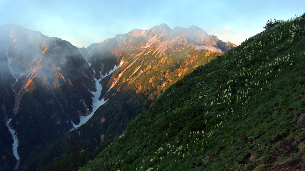 1/5 朝焼けの焼岳
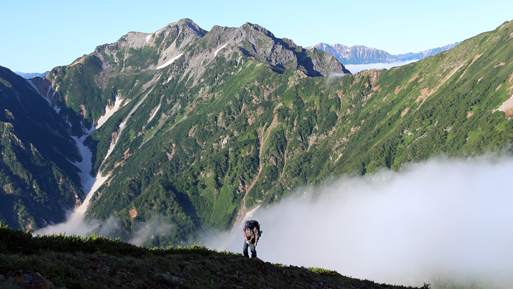 2/5 針ノ木岳、スバリ岳を背に岩小屋沢岳への登り
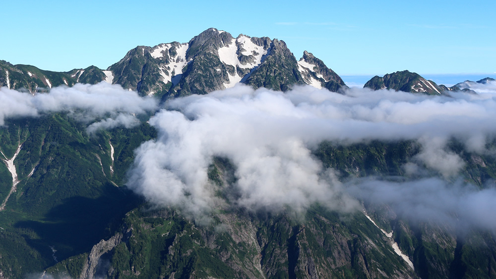 3/5 剣岳を真近に望む
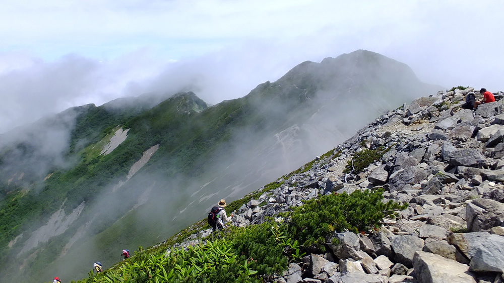
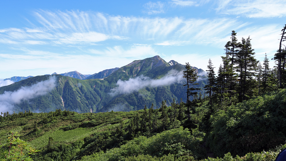 4/5 鹿島槍ヶ岳、後立山連峰
 5/5 岩小屋沢、鳴沢岳を背に岳爺ヶ岳への登り
本サンプル表示用HTML
<input type="radio" id="r1" name="gal">
<input type="radio" id="r2" name="gal">
<input type="radio" id="r3" name="gal">
<input type="radio" id="r4" name="gal">
<input type="radio" id="r5" name="gal">
<input type="radio" id="r6" name="gal">
<input type="radio" id="r7" name="gal">
<input type="radio" id="n1" name="gal">
<input type="radio" id="n2" name="gal">
<input type="radio" id="n3" name="gal">
<input type="radio" id="n4" name="gal">
<input type="radio" id="n5" name="gal">
<input type="radio" id="b1" name="gal">
<input type="radio" id="b2" name="gal">
<input type="radio" id="b3" name="gal">
<input type="radio" id="b4" name="gal">
<input type="radio" id="b5" name="gal">
<div id="thumbs">
  <label for="r1"><img src="wp-images/s1.jpg"></label>
  <label for="r2"><img src="wp-images/s2.jpg"></label>
  <label for="r3"><img src="wp-images/s3.jpg"></label>
  <label for="r4"><img src="wp-images/s4.jpg"></label>
  <label for="r5"><img src="wp-images/s5.jpg"></label>
</div>
<label for="r7">
	<div id="darkscreen"></div>
</label>
<div id="stage">
  	<div id="photo1">
    	<img src="wp-images/m1.jpg">
        <span class="span_l">1/5   朝焼けの焼岳</span>
        <label for="r6"><span class="span_r">? 閉じる</span></label>
        <label for="n1"><div id="right1" class="cover_right"><span>></span></div></label>
        <label for="b1"><div id="left2" class="cover_left"><span><</span></div></label>
    </div>
  	<div id="photo2">
    	<img src="wp-images/m2.jpg">
        <span class="span_l">2/5   針ノ木岳、スバリ岳を背に岩小屋沢岳への登り</span>
        <label for="r6"><span class="span_r">? 閉じる</span></label>
        <label for="n2"><div id="right2" class="cover_right"><span>></span></div></label>
        <label for="b2"><div id="left2" class="cover_left"><span><</span></div></label>
    </div>
  	<div id="photo3">
    	<img src="wp-images/m3.jpg">
        <span class="span_l">3/5   剣岳を真近に望む</span>
        <label for="r6"><span class="span_r">? 閉じる</span></label>
        <label for="n3"><div id="right3" class="cover_right"><span>></span></div></label>
        <label for="b3"><div id="left3" class="cover_left"><span><</span></div></label>
    </div>
  	<div id="photo4">
    	<img src="wp-images/m4.jpg">
    	<span class="span_l">4/5   鹿島槍ヶ岳、後立山連峰</span>
        <label for="r6"><span class="span_r">? 閉じる</span></label>
        <label for="n4"><div id="right4" class="cover_right"><span>></span></div></label>
        <label for="b4"><div id="left4" class="cover_left"><span><</span></div></label>
    </div>
  	<div id="photo5">
    	<img src="wp-images/m5.jpg">
        <span class="span_l">5/5   岩小屋沢、鳴沢岳を背に岳爺ヶ岳への登り</span>
        <label for="r6"><span class="span_r">? 閉じる</span></label>
        <label for="n5"><div id="right4" class="cover_right"><span>></span></div></label>
        <label for="b5"><div id="left5" class="cover_left"><span><</span></div></label>
    </div>
</div>
HTMLの概要説明
・ラジオボタン r1-r5 は、各スライドを FadeIn させるため、サムネイルに関連付けている。・ラジオボタン r6,r7 は、それぞれ閉じるボタンと遮蔽スクリーンに関連付けられていて、このクリックで初期画面に戻る。
・ラジオボタン n1-n5 は、右側の次のスライド、b1-b5 は、左側の次のスライドを登場させるボタン領域に関連付けている。 ・photo1 - photo5 は、それぞれ、写真とキャプションと閉じるボタンを含んだdivで、この全体を切り替える方式になっている。
・ボタン領域とは、各写真の上層に配置した、左40%の領域を覆う矩形(cover_left)と、右40%の領域を覆う矩形(cover_right)で、各領域のマウスオーバーで左右の矢印が表示され、そのクリックで左右のスライドに表示が切り替わるもの。
本サンプル表示用CSS
/*全サムネイルのコンテナー*/
#thumbs {
	position: relative;
	max-width: 630px;
	margin:0 auto;
}
/*サムネイルのマウスオーバーでポインターを手のひら*/
#thumbs label img {
	cursor: pointer;
}
/*ラジオボタンを非表示に*/
#r1, #r2, #r3, #r4, #r5, #r6, #r7,#n1,#n2,#n3,#n4,#n5,#b1,#b2,#b3,#b4,#b5 {
	display: none;
}
/* 写真表示領域 */
#stage {
	position:fixed !important;
	top:0;
	left:0;
	width:100%;
	height:100%;
	z-index:-100;
}
/*表示写真の初期配置(全部透明に)*/
#photo1, #photo2, #photo3, #photo4, #photo5 {
	position:absolute;
	max-width:1200px;
	width:62%;
	left:101%;
	top:15%;
	padding:5px 5px 10px 5px;
	background:#fff;
	opacity:0;
	-webkit-transition: opacity 1s ease;
        -moz-transition: opacity 1s ease;
        -o-transition: opacity 1s ease;
        transition: opacity 1s ease;
}
#photo1 img, #photo2 img, #photo3 img, #photo4 img, #photo5 img {
	max-width:1200px;
	width: 100%;
	height: auto;
}
/* 写真の表題 閉じるボタン*/
.span_l { float:left; margin:5px 0 0 5px; }
.span_r { float:right; font-weight:bold;  margin:5px 10px 0 0; cursor:pointer;}
/*写真表示時の画面遮蔽スクリーン*/
#darkscreen {
	position:fixed !important;
	position:absolute;
	width:100%;
	height:100%;
	top:0;
	left:0;
	background:#000;
	opacity:0.6;
	//display:none;
	z-index:-5;
}
/*ボタン領域の設定*/
.cover_left, .cover_right {
	position:absolute;
	top:0;
	width:40%;
	height:93%;
	cursor:pointer;
	z-index:1000;
}
.cover_left {
	left:0;
}
.cover_right {
	left:60%;
}
/*ボタン領域内のボタン文字(<、>)の設定*/
.cover_left span, .cover_right span {
	position: absolute;
	font-family: "ヒラギノ角ゴ Pro W3", "Hiragino Kaku Gothic Pro", "メイリオ", Meiryo, Osaka, "MS Pゴシック", "MS PGothic", sans-serif;
	font-size: 40px;
	font-weight: bold;
	opacity:0;
	top: 45%;
}
.cover_left span {
	left: 5%;
}
.cover_right span {
	left: 85%
}
/*ボタン領域hover時文字の設定*/
.cover_right:hover > span, .cover_left:hover > span {
	opacity:1;
	color:#EEE;
}
/* サムネイル、送りボタンチェックで#stageを表示*/
#r1:checked ~ #stage,#r2:checked ~ #stage,#r3:checked ~ #stage,#r4:checked ~ #stage,#r5:checked ~ #stage, #n1:checked ~ #stage, #n2:checked ~ #stage, #n3:checked ~ #stage, #n4:checked ~ #stage, #n5:checked ~ #stage, #b1:checked ~ #stage,#b2:checked ~ #stage, #b3:checked ~ #stage, #b4:checked ~ #stage, #b5:checked ~ #stage {
	z-index:100;
	opacity:1;
}
/* サムネイル、送りボタンチェックで#darkscreenを表示 */
#r1:checked ~ label #darkscreen, #r2:checked ~ label #darkscreen, #r3:checked ~ label #darkscreen, #r4:checked ~ label #darkscreen, #r5:checked ~ label #darkscreen, #n1:checked ~ label #darkscreen, #n2:checked ~ label #darkscreen, #n3:checked ~ label #darkscreen, #n4:checked ~ label #darkscreen, #n5:checked ~ label #darkscreen, #b1:checked ~ label #darkscreen, #b2:checked ~ label #darkscreen, #b3:checked ~ label #darkscreen, #b4:checked ~ label #darkscreen, #b5:checked ~ label #darkscreen {
 display:block;
 z-index:90;
}
/* 各サムネイルがチェックされた時の#photos の位置*/
#r1:checked ~ #stage #photo1,#r2:checked ~ #stage #photo2,#r3:checked ~ #stage #photo3,#r4:checked ~ #stage #photo4,#r5:checked ~ #stage #photo5 {
	opacity:1;
	left:19%;
	z-index:101;
}
/* 各送りボタンがクリックされた時のスライド送りのanimationの設定とanimationの定義 */
#n1:checked ~ #stage #photo1,#n2:checked ~ #stage #photo2,#n3:checked ~ #stage #photo3,#n4:checked ~ #stage #photo4,#n5:checked ~ #stage #photo5 {
	opacity:1;
	-webkit-transition:left 0s ease;
	-moz-transition:left 0s ease;
	transition:left 0s ease;
	left:19%;
	-webkit-animation:passphotos1 1s ease;
	-moz-animation:passphotos1 1s ease;
	animation:passphotos1 1s ease;
	-webkit-animation-fill-mode: forwards;
	-moz-animation-fill-mode: forwards;
	animation-fill-mode: forwards;
}
#n1:checked ~ #stage #photo2,#n2:checked ~ #stage #photo3,#n3:checked ~ #stage #photo4,#n4:checked ~ #stage #photo5,#n5:checked ~ #stage #photo1 {
	opacity:1;
	transition:left 0s ease;
	left:81%;
	-webkit-animation:passphotos2 1s ease;
	-moz-animation:passphotos2 1s ease;
	animation:passphotos2 1s ease;
	-webkit-animation-fill-mode: forwards;
	-moz-animation-fill-mode: forwards;
	animation-fill-mode: forwards;
}
#b1:checked ~ #stage #photo1,#b2:checked ~ #stage #photo2,#b3:checked ~ #stage #photo3,#b4:checked ~ #stage #photo4,#b5:checked ~ #stage #photo5 {
	opacity:1;
	transition:left 0s ease;
	left:19%;
	-webkit-animation:passphotos3 1s ease;
	-moz-animation:passphotos3 1s ease;
	animation:passphotos3 1s ease;
	-webkit-animation-fill-mode: forwards;
	-moz-animation-fill-mode: forwards;
	animation-fill-mode: forwards;
}
#b5:checked ~ #stage #photo4,#b4:checked ~ #stage #photo3,#b3:checked ~ #stage #photo2,#b2:checked ~ #stage #photo1,#b1:checked ~ #stage #photo5 {
	opacity:1;
	transition:left 0s ease;
	left:-43%;
	-webkit-animation:passphotos4 1s ease;
	-moz-animation:passphotos4 1s ease;
	animation:passphotos4 1s ease;
	-webkit-animation-fill-mode: forwards;
	-moz-animation-fill-mode: forwards;
	animation-fill-mode: forwards;
}
/*  */
@-webkit-keyframes passphotos1 {
	0% { left:19%; }
	100% { left:-43%; opacity:0; }
}
@-moz-keyframes passphotos1 {
	0% { left:19%; }
	100% { left:-43%; opacity:0; }
}
@keyframes passphotos1 {
	0% { left:19%; }
	100% {left:-43%; opacity:0;}
}
/*  */
@-webkit-keyframes passphotos2 {
	0% { left:81%; }
	100% { left:19%;}
}
@-moz-keyframes passphotos2 {
	from { left:81%; }
	to { left:19%; }
}
@keyframes passphotos2 {
	0% { left:81%; }
	100% { left:19%; }
}
/*  */
@-webkit-keyframes passphotos3 {
	0% { left:19%; }
	100% { left:81%; opacity:0;}
}
@-moz-keyframes passphotos3 {
	from { left:19%; }
	to { left:81%; opacity:0; }
}
@keyframes passphotos3 {
	0% { left:19%; }
	100% { left:81%; opacity:0;}
}
/*  */
@-webkit-keyframes passphotos4 {
	0% { left:-43%; }
	100% { left:19%;}
}
@-moz-keyframes passphotos4 {
	from { left:-43%; }
	to { left:19%; }
}
@keyframes passphotos4 {
	0% { left:-43%; }
	100% { left:19%; }
}
CSSのポイント説明
・#stage, #photo1-#photo5, #darkscreen、ボタン領域などについては、前稿「Fadein型」に同じ。・#n1-#n5 には、現在表示スライドを左に移動・FadeOutと次のスライドを右から移動して表示を同時に行うアニメーションを設定している。
・#b1-#b5 には、現在表示スライドを右に移動・FadeOutと次のスライドを左から移動して表示を同時に行うアニメーションを設定している。
・上記2つのアニメーションは、Ieとchromeでは単純な記述でうまく機能したが、Firefoxでは苦戦した。したがって、少しくどいスクリプトになっている。
参考にさせていただきます。CSSだけでコーディングしてるのが凄いです。古いブラウザでも割と対応しているのでありがたいです。
お役に立ててうれしいです。
どうぞご活用ください。