サンプル


本サンプル表示用HTML
<div id="stage">
<ul>
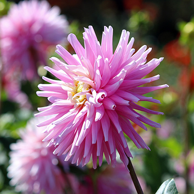
<li><img src="wp-images/f1.jpg" width="300" height="300"></li>
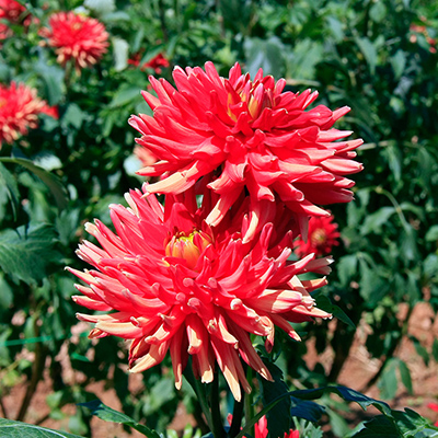
<li><img src="wp-images/f2.jpg" width="300" height="300"></li>
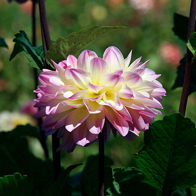
<li><img src="wp-images/f3.jpg" width="300" height="300"></li>
<li><img src="wp-images/f4.jpg" width="300" height="300"></li>
<li><img src="wp-images/f5.jpg" width="300" height="300"></li>
</ul>
</div>
HTMLのポイント説明
・表示写真を、li で並べただけのシンプルなものである。本サンプル表示用CSS
/* 表示枠 */
#stage {
		position:relative;
		width:300px;height:300px;
		background:#000;
		overflow:hidden;
	}
	#stage ul {
		list-style:none;
	}
/* 表示写真の設定 */
	#stage li img {
		position:absolute;
		top:0px;
		left:0px;
		border-top:5px solid #ddd;
		border-left:5px solid #ddd;
		border-right:5px solid #555;
		border-bottom:5px solid #555;
		opacity:0;
		-webkit-transform-origin:50% 50%;
		transform-origin:50% 50%;
	}
/* 各スライドのanimation設定(4秒ずつずらしてplay)*/
	#stage li:nth-child(1) img {
		-webkit-animation:selfrot 20s ease 0s infinite;
		animation:selfrot 20s ease 0s infinite;
	}
	#stage li:nth-child(2) img {
		-webkit-animation:selfrot 20s ease 4s infinite;
		animation:selfrot 20s ease 4s infinite;
	}
	#stage li:nth-child(3) img {
		-webkit-animation:selfrot 20s ease 8s infinite;
		animation:selfrot 20s ease 8s infinite;
	}
	#stage li:nth-child(4) img {
		-webkit-animation:selfrot 20s ease 12s infinite;
		animation:selfrot 20s ease 12s infinite;
	}
	#stage li:nth-child(5) img {
		-webkit-animation:selfrot 20s ease 16s infinite;
		animation:selfrot 20s ease 16s infinite;
	}
	@-webkit-keyframes selfrot {
		0%  {-webkit-transform:rotate(-180deg) scale(0,0);opacity:1;}
		5%  {-webkit-transform:rotate(0deg) scale(1,1);}
		15% {-webkit-transform:rotate(0deg) scale(1,1);}
		20% {-webkit-transform:rotate(180deg) scale(0,0);}
		100%{-webkit-transform:rotate(180deg) scale(0,0);opacity:1;}
	}
	@keyframes selfrot {
		0%  {transform:rotate(-180deg) scale(0,0);opacity:1;}
		5%  {transform:rotate(0deg) scale(1,1);}
		15% {transform:rotate(0deg) scale(1,1);}
		20% {transform:rotate(180deg) scale(0,0);}
		100%{transform:rotate(180deg) scale(0,0);opacity:1;}
	}
CSSのポイント説明
・transform-origin:50% 50%; で、回転の起点を写真中心に取る。・#stage li:nth-child(1) img は、li の一番目の項目(写真)。
・animation:selfrot 20s ease 4s infinite; で、20秒間隔のアニメの繰り返しと、4秒遅れで再生開始を設定。
・各スライドの表示(拡大1s・静置2s・縮小1s)間隔を4秒に取り、あとの16秒は縮小したまま待機させる。
すなわち、0-20%で表示、20-100%で待機とする。