サンプル(DEMO)
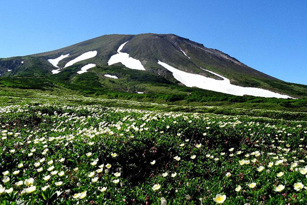
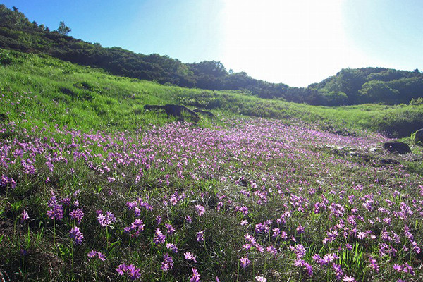
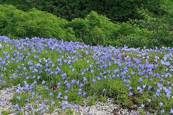
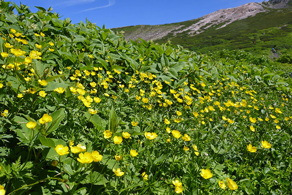
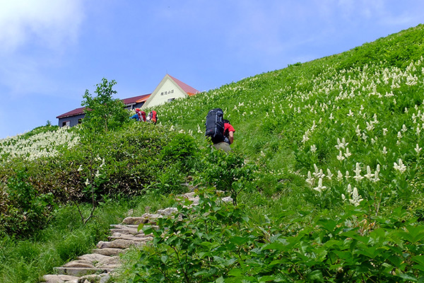
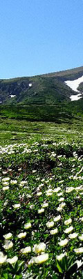
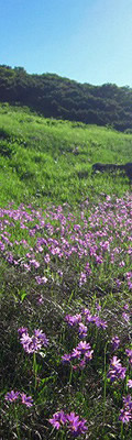
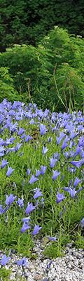
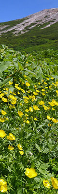
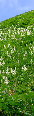
用意する画像(このサンプルの場合)
・600*400pxのスライド5枚・120*400pxのスライス画像各1枚(各スライドの登場番手に相当するスライス)
本サンプル表示用HTML
<div id="stage">
    <div id="photos">
        <ul>
            <li><img src="img9/1.jpg"></li>
            <li><img src="img9/2.jpg"></li>
            <li><img src="img9/3.jpg"></li>
            <li><img src="img9/4.jpg"></li>
            <li><img src="img9/5.jpg"></li>
        </ul>
    </div>
    <div id="slices">
        <ul>
            <li><img src="img9/1s.jpg"><div></div></li>
            <li><img src="img9/2s.jpg"><div></div></li>
            <li><img src="img9/3s.jpg"><div></div></li>
            <li><img src="img9/4s.jpg"><div></div></li>
            <li><img src="img9/5s.jpg"><div></div></li>
        </ul>
    </div>
</div>
<!-- 以下の記述は表示枠の高さ保持のためで68%の値は要調整 -->
<div style="padding-top:68%"></div>
本サンプル表示用CSS
/* 表示枠 */
#stage { position:relative;max-width:600px; }
/* li属性、画像下に生成するスペース除去 */
li { list-style:none; }
li img { display:block; }
/* スライドを全て同じ位置に */
#photos li {
	position:absolute; top:0; left:0;
}
/* スライド画像を伸縮可に */
#photos li img { width:100%; }
/* 各スライドのanimation */
#photos li:nth-child(1) { animation:switchPhotos 30s ease infinite; animation-delay:-0s; }
#photos li:nth-child(2) { animation:switchPhotos 30s ease infinite; animation-delay:-24s; }
#photos li:nth-child(3) { animation:switchPhotos 30s ease infinite; animation-delay:-18s; }
#photos li:nth-child(4) { animation:switchPhotos 30s ease infinite; animation-delay:-12s; }
#photos li:nth-child(5) { animation:switchPhotos 30s ease infinite; animation-delay:-6s; }

@keyframes switchPhotos {
	0% { opacity:0; }
	5% { opacity:1; }
	20% { opacity:1; }
	25% { opacity:0; }
	100% { opacity:0; }
}

/* 各スライドを上付きに、幅を1/5に */
#slices li {
	position:absolute; top:0;
	width:20%;
}
/* スライス画像を伸縮可に */
#slices li img { width:100%; }
/* 各スライス画像の上に同じサイズで黒いスクリーン(表示時はopacity:0.4)を置く */
#slices li div { width:100%;height:100%;background:#000; position:absolute; top:0; }
/* 各スライス画像の位置決め */
#slices li:nth-child(1) { left:0%; }
#slices li:nth-child(2) { left:20%; }
#slices li:nth-child(3) { left:40%; }
#slices li:nth-child(4) { left:60%; }
#slices li:nth-child(5) { left:80%; }
/* 各スライス画像のanimation */
#slices li:nth-child(1) > img { animation:switchSlices 30s ease infinite; }
#slices li:nth-child(2) > img { animation:switchSlices 30s ease infinite; animation-delay:-24s; }
#slices li:nth-child(3) > img { animation:switchSlices 30s ease infinite; animation-delay:-18s; }
#slices li:nth-child(4) > img { animation:switchSlices 30s ease infinite; animation-delay:-12s; }
#slices li:nth-child(5) > img { animation:switchSlices 30s ease infinite; animation-delay:-36s; }
/* スライス画像にタイミングを合わせて各スクリーンをanimateさせる */
#slices li:nth-child(1) > div { animation:switchScreen 30s ease infinite; }
#slices li:nth-child(2) > div { animation:switchScreen 30s ease infinite; animation-delay:-24s; }
#slices li:nth-child(3) > div { animation:switchScreen 30s ease infinite; animation-delay:-18s; }
#slices li:nth-child(4) > div { animation:switchScreen 30s ease infinite; animation-delay:-12s; }
#slices li:nth-child(5) > div { animation:switchScreen 30s ease infinite; animation-delay:-36s; }

@keyframes switchSlices {
	0% { opacity:0;  }
	5% { opacity:1; }
	15% { opacity:1; }
	20% { opacity:1; }
	25% { opacity:1; }
	30% { opacity:0; }
	40% { opacity:0; }
	45% { opacity:1; }
	50% { opacity:0; }
	60% { opacity:0; }
	65% { opacity:1; }
	70% { opacity:0; }
	80% { opacity:0; }
	85% { opacity:1; }
	90% { opacity:0; }
	100% { opacity:0; }
}

@keyframes switchScreen {
	0% { opacity:0;  }
	5% { opacity:0; }
	15% { opacity:0; }
	20% { opacity:0; }
	25% { opacity:0.4; }
	30% { opacity:0; }
	40% { opacity:0; }
	45% { opacity:0.4; }
	50% { opacity:0; }
	60% { opacity:0; }
	65% { opacity:0.4; }
	70% { opacity:0; }
	80% { opacity:0; }
	85% { opacity:0.4; }
	90% { opacity:0; }
	100% { opacity:0; }
}