先稿で円形ワイプ型のギャラリーを紹介したが、今回は、スライドショーの紹介である。下に示したサンプルは、円形スライドを円形ワイプで切り替えるタイプのスライドショーである。
別ページには、下のサンプルのスライドをクリックすると、ギャラリーの稿で示した拡大写真が表示されるサンプル2を示した。このサンプル2は、最新のIe、Firefox、Chromeでは正常表示されるが、Microsoft Edge では、拡大写真が表示されたときに二つのanimationを停止させるタイミングがずれてしまうことがわかった。私には原因がわからないので対処不能であるが、参考のため紹介しておきたい。
サンプル1(DEMO) サンプル2は別ページにあります。
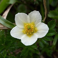 チングルマ
チングルマ コマクサ
コマクサ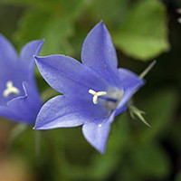 イワギキョウ
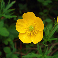 キンポウゲ
キンポウゲ コバイケイソウ
サンプル1表示用HTML
<div id="stage">
  <div id="frame">
    <div id="photos">
      <div class="pic"><img src="img9/s1.jpg"><span class="memo">チングルマ</span></div>
      <div class="pic"><img src="img9/s2.jpg"><span class="memo">コマクサ</span></div>
      <div class="pic"><img src="img9/s3.jpg"><span class="memo">イワギキョウ</span></div>
      <div class="pic"><img src="img9/s4.jpg"><span class="memo">キンポウゲ</span></div>
      <div class="pic"><img src="img9/s5.jpg"><span class="memo">コバイケイソウ</span></div>
    </div>
    <div id="shutter">
      <div class="part1"><div class="arc1"></div></div>
	  <div class="part2"><div class="arc2"></div></div>
    </div>
  </div>
</div>
サンプル1表示用CSS
/* 表示画面 */
#stage {
	position: relative;
	width: 200px;
	height:200px;
	padding:10px;
}
/* 表示枠 */
#frame {
	width: 200px;
	height: 200px;
	position: absolute;
	top:0;
	left:0;
	overflow: hidden;
}
/*全ての写真を水平一列に格納したdiv、#photosに,
スライドショーの基本の animation を設定*/
#photos {
	position:absolute;
	top:0;
    width:1200px;
	animation: imgPassToLeft 30s infinite;
}
/*各写真の並びを水平に設定*/
.pic {
	position:relative;
	float:left;
}
.pic img {
	border-radius:50%;
}
.memo {
	display:block;
	position:absolute;
	left:53px;
	bottom:20px;
	color:#fff;
	font-weight:bold;
	background:rgba(0,0,0,0.4);
}
/* スライドの上層で開閉するシャッター */
#shutter {
	pointer-events: none;
}
/* 左右の半円 */
.part1,.part2 {
	position:absolute;
	width:100px;height:200px;
	overflow:hidden;
	background:transparent;
}
.part1 {
	top:0;left:100px;
}
.part2 {
	top:0;left:0px;
}
.arc1,.arc2 {
	top:0;left:0;
	width:0;height:0;
	border-radius: 50%;
	border:100px solid transparent;
}
.arc1 {
	margin-left:-101px;
    border-top:100px solid #000;
    border-right:100px solid #000;
	transform:rotate(45deg);
	animation:rot1 6s linear infinite;
	animation-fill-mode: forwards;
}
.arc2 {
	margin-left:1px;
    border-bottom:100px solid #000;
    border-left:100px solid #000;
	transform:rotate(45deg);
	animation:rot2 6s linear infinite;
	animation-fill-mode: forwards;
}
/* スライド切替animation設定 */
@keyframes imgPassToLeft {
	0%  {   left:   0%;}
	19.99%{ left:   0%;}
	20% {   left:-100%;}
	39.99%{ left:-100%;}
	40% {   left:-200%;}
	59.99%{ left:-200%;}
	60% {   left:-300%;}
	79.99%{ left:-300%;}
	80% {   left:-400%;}
	99.99%{ left:-400%;}
	100% {  left:   0%;}
}
/* 円弧のanimation */
@keyframes rot1 {
	0% { transform:rotate(45deg); }
	10% { transform:rotate(225deg); }
	95% { transform:rotate(225deg); }
	100% { transform:rotate(45deg); }
}
@keyframes rot2 {
	0% { transform:rotate(45deg); }
	10% { transform:rotate(45deg); }
	20% { transform:rotate(225deg); }
	90% { transform:rotate(225deg); }
	95% { transform:rotate(45deg); }
	100% { transform:rotate(45deg); }
}